July 11, 2023
By Kevin Schultz
Scoring the Best Minor League Hockey Jerseys From Defunct Franchises
The best minor league hockey logos, as picked by our hockey fans
Vintage Ice Hockey is celebrating some of the best minor league hockey jerseys and logos of all time. The teams we’ve decided to feature represent defunct teams whose legacies should never be forgotten. These jerseys are all unique, memorable, and represent a strong sense of nostalgia for hockey fans. While there are way too many infamous jerseys for us to cover in this article, we couldn’t resist highlighting a few of our favorites.
Celebrating Unique Hockey Jerseys from Defunct Franchises
This list was curated by life-long hockey fans that love all the eccentricities, oddities, and uniqueness of minor league hockey in the USA. Vintage Ice Hockey also offers some of the most unique and eye-catching logos in minor league hockey history, including jerseys!
Table of Contents
- Kentucky Thoroughblades
- Columbus Chill
- Albany River Rats
- Danbury Trashers
- Madison Monsters
- Baltimore Clippers
- New Haven Nighthawks
- Detroit Vipers
- Tallahassee Tiger Sharks
- Louisville RiverFrogs
- Baltimore Bandits
- Buffalo Norsemen
1. Kentucky Thoroughblades
The Kentucky Thoroughblades first took the ice in Rupp Arena for the 1996-1997 season. The Thoroughblades’ colors and logo created one of the most unique jerseys in all of pro sports. The teal, purple, and silver color combo alongside the angry, muscular horse on skates was a unique looks for all sports fans at the time and still is to this day! The jersey and fan merchandise fit in extremely well with the 90s fashion aesthetic and teal was definitely a 90s color. With such a rich sports history already established in Kentucky, many Kentuckians could be found sporting Thoroughblades’ merchandise- even those who had never seen a game.
The Thoroughblades had a large fan base. In the beginning, they drew crowds of 8,000. They didn’t disappoint their fans either, as they had winning seasons and playoff appearances all five of their years in Kentucky. Several big leaguers moved through the Thoroughblade ranks including future hall of famer Zdeno Chara as well as Jonathan Cheechoo, Dan Boyle, and Evgeni Nabokov. By year three, the team had improved even further with a 44 win season and had two future big leaguers between the pipes: Nabokov and Miikka Kiprusoff. That stud goaltending tandem added Johan Hedberg in the 1999-00 season and celebrated another 40 wins. Both years, they made it to the second round of the playoffs.
The Thoroughblades had amazing success, but when their fanbase started to dwindle from brining in 8,000 per game to bringing in 4,500 per game, owners decided it was time to sell. The Kentucky Thoroughblades became the Cleveland Barons. The franchise still exists today as the Barracuda and is tied to San Jose.


2. Columbus Chill
The Columbus Chill could be categorized as one of the most impactful teams of all time. They joined the ECHL in 1991. Their outlandish and borderline offensive ad campaigns drew an insane amount of attention to the franchise. The team found immediate success and started a sellout streak in January 1992 that would last 83 games, with 80% of all games in franchise history sold out. They weren’t necessarily a stellar team on the ice, but their fan base was so supportive that when they made it to a playoff game, their venue couldn’t accommodate the crowd. Fans were so disappointed that when Chill management started a campaign to urge the franchise to find a new venue, fans rallied in support. This garnered the attention of the NHL, who added a franchise to their roster and led to the end of the Chill. The Chill made big changes in Columbus, and are ultimately responsible for a big team moving to the area.
The Chill’s jerseys played into their edgy marketing campaign as well. They went with a completely original (and never again duplicated) icicle design that had diagonal triangles throughout. They also chose to flip tradition – literally – with their logo and printed the word “CHILL” vertically on the jerseys. The Chill bucked sports marketing tradition in so many ways and their jerseys were no exception. But they didn’t stop with just their regular jerseys. They were also pioneers in the third jersey or alternate jersey space, wearing all kinds of thematic jerseys throughout their run including tie dye jerseys, roman numeral jerseys, and most famously, the Columbus Mad Cows jersey.
3. Albany River Rats
The River Rats have one of the best logos in hockey history and their team name is also one of the most unique. Even though their jersey design was pretty basic, it is still among the most sought after because of the logo and name originality that can’t be matched.
The River Rats had a long two-decade run in New York. First affiliated with New Jersey and they saw lots of NHL players moved through their ranks including Patrick Elias, Zack Parise, Brian Gionta, and Mike Dunham. With the New Jersey affiliation, the Rats of the 1990s and early 2000s wore red, white, and black Devils style jerseys. However, when their affiliation changed to the Carolina Hurricanes, they wore the same colors but instead had the flag pattern the Hurricanes were known for.
One interesting tidbit – the River Rats never really changed from their two jersey styles. But there is one long-lost jersey style. The Rats had printed up prototypes of a black jersey with rat footprint shoulder patches. However, these would never see the ice as supposedly they were nixed late in the process by an executive. But if you search real hard on ebay, one of these pops up every few years.


Danbury Trashers logo from wikipedia
4. Danbury Trashers
This list would have no credibility what-so-ever if we didn’t mention the Trashers. With their logo being a literal trashcan, you know this team had some fun during their time on the ice. Recently, the Trashers have been getting a lot of traction because they were featured in an episode of the Netflix docuseries Untold: Crime & Penalties. The story of the Trashers is way more in depth than we could detail here, but their saga began in 2004 when an alleged mobster gifted the team to his son, AJ Galante, for his 17th birthday. Unfortunately, the team would only two seasons before folding.
AJ has said that losing the team was hard because he had spent so much of his life obsessed with building it. The team was pretty wild as their list of activities included playing pranks on the opposing team to throw them off, setting off the fire alarm before a game in the middle of the night, and an absurd amount of penalty minutes all around. AJ has also said that one of the hardest things to hear about the team was that they didn’t have any talent or that talented players weren’t interested in being a Trasher because that couldn’t have been further from the truth. AJ said people were tripping over themselves to join the team because they had a tough and exciting reputation.
Trashers merch has recently soared in popularity after the Netflix documentary aired. Drake even drew up some attention by sporting his Trashers jersey in a recent Instagram post. Though the logo is, as mentioned above, a trashcan… the black/blue/silver color scheme is unique and original. AJ said it’s been crazy to see all this hype over the Trashers nearly two decades later.
The Thrashers didn’t leave a neat and clean legacy with their players getting allegedly paid under the table, all the penalties and injuries they acquired (and caused), but without a doubt they are one of the most legendary minor league hockey teams out there.
5. Madison Monsters
The Madison Monsters were a Colonial Hockey League (CoHL) team that originated in Madison, Wisconsin. They had successful seasons from 1995-1999. Their logo was bright, colorful, and fit right in with the ‘90s aesthetic. It also had a cool twist on the average hockey logos at the time as it depicted a monster tearing through the front of a jersey. Fans loved this and the Monsters made good money on their merch before ever taking the ice. The most unusual part of what was a very unusual logo and jersey combination was that the Monsters wore pinstripe jerseys, which are very unusual for a hockey team.
The Monsters memory lives on through their logo, of course, but they are also remembered because of their Broadstreet Bully connections. While Mark Johnson helped the team get established their first year, he left after one season. The 1996-1997 season was lead by David Schultz, a Philadelphia Flyers alumni. They also made headlines when NHLer Reggie Leach suited up for a game at age 47 after 10 years of retirement. He might be the only hockey player in history to have a 10 year gap between their two “final” seasons. The Monsters franchise moved to Knoxville in 1999 and became the Speed, but their original logo will remain one of the best in minor league history.


6. Baltimore Clippers
The history of the Baltimore Clippers can get a little tricky to unravel. They played for many years in Maryland in several leagues. The first appearance of the Clippers was in the Eastern Hockey League (EHL) for the 1945-46 season. They played at Carlin's Iceland. During their 1947-48 season, they won the EHL's Walker Cup. The franchise folded in December 1949, but started up again for the 1954-55 season. Their next roadblock hit in January of 1956, midseason, when Carlin’s Iceland burned down. After the loss of their stadium, the Clippers moved to Charlotte.
In 1962, the Clippers were revived as an AHL team with an orange and black color scheme, similar to Baltimore’s baseball team and it was by far the most successful iteration of the Clippers. Their sailor logo is very unique and recognizable and one of the best logos of all time. The Clippers were in the AHL through 1975 and won the AHL regular season title in 1970-71. However, they ran short on NHL affiliates and found the AHL increasingly costly for operation. The team joined the SHL in 1976-77 in an effort to save on league and travel costs. However, the SHL folded January 1977 in the middle of the season. The Clippers did the same.
NHL Hall of Fame Clipper alumni include Eddie Giacomin, Doug Harvey, Jacques Plante, and Jean Ratelle.
7. New Haven Nighthawks
The New Haven Nighthawks’ story began when they joined the AHL for the 1972-73 season. The Nighthawks were the inaugural team to take the ice in the New Haven Coliseum in '72. They would play there through 1992.
The Nighthawks jerseys were more traditional than most of the teams on this list, with a conventional stripe pattern. However, their logo is a classic. A symmetrical bird with wings and feet, and with a beck in the middle, it is a very sleek logo and well designed.
The Nighthawks kept the same logo throughout their history, but went through some color changes over the years as their big league affiliation changed. They started with a gold and blue color scheme, which did not correlate with their Minnesota affiliation. By 1977, the team became an affiliate of the much more local New York Rangers and donned red and blue. In the mid-80s, they changed to silver and black, as they became affiliated with Los Angeles.


8. Detroit Vipers
Even though Vintage Ice Hockey doesn’t currently offer Detroit Vipers merch, we couldn’t exclude them from our list. Their vibrant teal, red, and black colors make them stand out from other teams, as well as their striking viper logo that is completely unique and impressively designed.
The Vipers were active from 1994-2001 and their home arena was The Palace of Auburn Hills in Detroit. The Vipers got their name from a sponsorship deal with Chrysler for a Dodge Viper promotion. The Vipers had many successes in their run including a championship win in 1994 and they set an attendance record within IHL early on. The team, obviously motivated by sponsorships, had some other memorable moments including beating an NHL all star team during the lockout and bringing Gordie Howe out of retirement for one game at the age of 69. The Vipers remained competitive in all of their early years, with the cherry on top of their history being a Turner Cup championship in 1997.
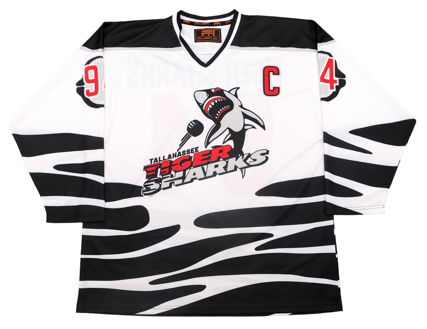
9. Tallahassee Tiger Sharks
In the late ‘90s, The Tallahassee Tiger Sharks spent seven seasons playing at the Tallahassee-Leon County Civic Center. They relocated from Huntsville, AL and took the ice in Tallahassee for the 1994-95 season.
When the Tiger Sharks came to Tallahassee, they rebranded and donned a jersey like no other. True to their moniker, they skipped the traditional hockey stripes and instead put tiger stripes on their jerseys! They are of the most unusual and difficult to reproduce designs that we’ve ever encountered. The red, white, and black color scheme is also a serious winner.
On the ice, the team found immediate success. They won 36+ games each of their first three seasons, making the playoffs all three times. In 1995-96, they won a team record (42 games) and advanced to the third round of playoffs before losing to Charlotte, who went on to win the championship. During these years, the team received solid fan support with over 6,000 per game attending.
Toward the end of their run, the Tiger Shark’s luck took a turn for the worse. Attendance dipped and things got really weird when the team was docked $50,000 and 15 points in the standings for circumventing the league salary cap and making payments to NHL and AHL teams for players. This all took place in the team's final season in Tallahassee: 2000-01. After that season, the team relocated to Georgia.


Louisville RiverFrogs replica hockey jersey
10. Louisville RiverFrogs
The Louisville Riverfrogs’ jersey is straight out of the ‘90s.. From the funky fonts, to the color scheme, to the mean looking frog… everything about this jersey screams ‘90s aesthetic.
The Riverfrogs started play in 1995 and they didn’t have a large fan base, but they did have an enthusiastic fan base! In an article covering the Riverfrogs that was reported by WLKY, they referred to the team’s mascot as kitchy and alarming, so you can imagine the fun their fanbase would have attending games along side a large, inflatable, lime green frog. The over-the-top design of the Riverfrogs’ jerseys and strange frog logo aren’t the only thing that made the Riverfrogs unusual. They were aslo known for crazy antics to draw in a crowd including having hot tubs in the arena! Unfortunately all of that wasn’t enough to keep the franchise in business, and the Riverfrogs only lasted three seasons in Louisville.
11. Baltimore Bandits
The Bandits had big shoes to fill in Baltimore, as they took the ice after 50 years of Clippers and Skipjacks hockey. They had their first game in 1993, and immediately ran into trouble as they shared an arena with an indoor soccer team that pretty much dominated the schedule on weekends. After only two seasons, the Bandits were sold and moved to Cincinnati.
The saving grace for the Bandits’ memory is their jersey design. It has a cool color scheme with it’s play on black/white/silver/purple and fans loved the “Bandit Racoon” on their merch. With Baltimore already having such a rich hockey tradition and culture, people purchased Bandits’ hockey merch even if they weren’t a fan of the team just because they liked hockey and they liked the logo!
The Bandits also had two different jerseys designs, one in each of their seasons. Their first season saw the jersey pictured here, with the diagonal stripe across the chest; a very unusual hockey jersey design element. In their second season, the design was fairly similar and featured the same raccoon logo, but this time the jersey’s diagonal stripe had a gradient. Because hey, it was the 90s and teams were trying out all kinds of funky designs.


12. Buffalo Norsemen
Alright, so for the last jersey on our list we have to be honest; this isn’t a “real” jersey design, it’s a custom design that we came up with. But it is for a real team! The Buffalo Norsemen spent all of one season playing in Buffalo in 1975-76, but they had an awesome Viking logo and a secondary shield logo. But their jerseys were somewhat unremarkable and inexplicably didn’t feature the Norsemen logo on the jersey! So we felt that we had to fix that.
While we offer the original white version of their jersey, we also created our own design that incorporated the viking logo. The green jersey in our shop is our design. The bright green and yellow color scheme and the Viking logo make this a standout on our list. The Norsemen had a missed opportunity when they opted to leave their logo off the jersey originally!
Despite their name, they didn’t actually play in Buffalo. The Norsemen played at the Tonawanda Sports Center in North Tonawanda, NY. The Norsemen went 30-44 and lost in the first round of the playoffs in their single season.
We hope you enjoyed our run down of the best minor league hockey jerseys! There are so many unique and wild minor league hockey jerseys, we couldn't summarize them all here, but let us know what your favorite is and if you'd like to see us recreate it. We're minor league hockey aficianados and love all the different jerseys from the unusual and eclectic to the classic and timeless. So even if you're favorite team's jersey isn't listed here, you can check out all of the different jerseys that we offer!
Uniquely Cool Gifts for Hockey Fans Are Only a Few Clicks Away
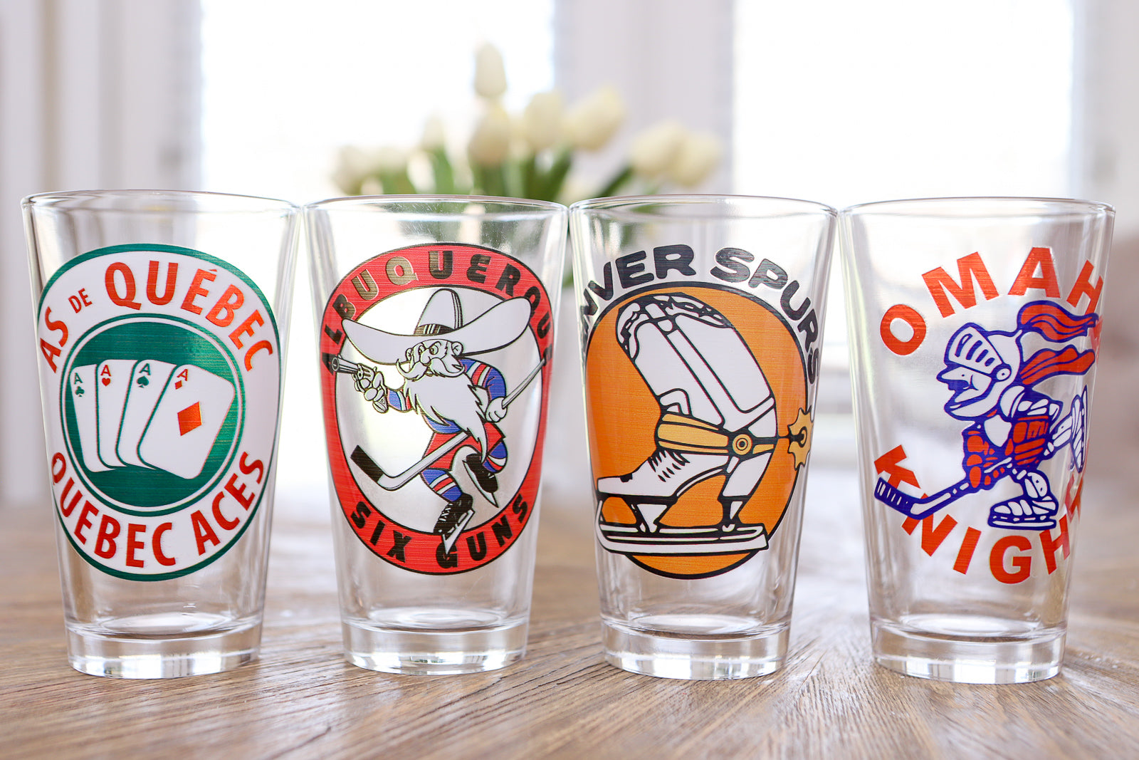
Shop for Hockey Gear by StateShop for Hockey Gear A-ZShop for Hockey MugsShop for Souvenier Hockey PucksShop for Hockey Pint GlassesMore Posts from Vintage Ice Hockey
Marquette Iron Rangers Hockey: The Stories of Karen Koch, Coach Leonard “Oakie” Brumm, and The Carlson Brothers
The 12 Best Minor League Hockey Jerseys From Defunct Franchises